Party in my Dorm
Game specifications
Genre: College Roleplay Simulator
Infos: Mobile & Tablet, Casual MMO college sim. Social game released in 2010
Engine: XCode & Android Studio
Business model: F2P, In game purchase

From October 2017 to October 2021, I worked on the UI of the live ops game Party in my Dorm.Genre: College Roleplay Simulator
Infos: Mobile & Tablet, Casual MMO college sim. Social game released in 2010
Engine: XCode & Android Studio
Business model: F2P, In game purchase

Major tasks and responsibilities:
- UI: prototype/wireframe new features, design interfaces. Revamp old features to fit the newest graphic chart. Develop further the UI Bible as game UI evolves.
- UX: organize beta test/play tests and QA. Create and analyse surveys. Compile player feedback/interview with CMs for future improvements.
- Integration: I learnt to use XCode (Objective-C) and Android Studio (XML, Java) to be able to fix UI bugs and update some of the simpler UI without the help of an engineer. This gave me additional insights on UI integration on these platform, proving valuable when working with co-ops programmers and new employees.
- Marketing: ASO Art and Google Play experiments (App icons, feature banners, screenshots, loading screen)
Party in my Dorm was first released in December 2010, so the game has a large (and still growing!) active community. It has also greatly evolved over the years, and gone through several graphical transformations. The community is very supportive and willing to try out new things. I learnt a lot from iterating and discussing with players.
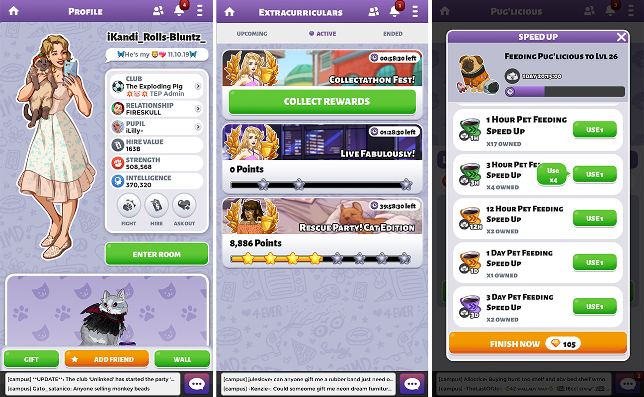

Examples of UI: Profile, Competition system, Timer speed up screen
In above example, the profile screen had been designed by the previous UI/UX Designer working on PIMD, but only implemented on Android Studio. I decided to learn to use XCode to update the profile on iOS and then proceeded to iterate changes on iOS and Android versions.
The third screenshot (on the left) is a smaller feature allowing players to speed up timer items (boxes or pet) using speed up items. The optimal quantity to use for a given speed up appears whenever the player presses Use 1.
Left: Various icons and buttons for PIMD
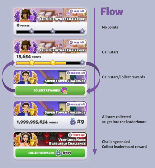
Right: Screenshot from a work document explaining the different phases of a UI element for the competition system (Extracurricular, or XC)
In term of work flow, I usually start with analyzing the feature's need on paper and imagine the different scenarios (sort of User stories). Once I feel I have enough of an understanding, I proceed to make a prototype wireframe using adobe XD. The graphic language of the game is already well established, so usually the UI Layout is quick. If some small art assets are needed I draw them with the feedback of an artist. Icons and layouts are done in photoshop.
I compile every screen and icons into a Google Presentation, with a link towards playable wireframe when necessary. I write down additional notes about the flow, animations and edge cases for the engineer in charge of implementation.
It is common that during the implementation I work hand in hand with the engineer to do the polish (or pixel push) in XCode and Android studio. We use Asana to track bugs and to-dos. Git to share branches.
App icons researches. After competitor analysis, I decided to test icons with more than one subject matter
Follow several phases of internal QA and polish, if necessary closed or open beta, and release plan (with usually a close internal beta release for last check).
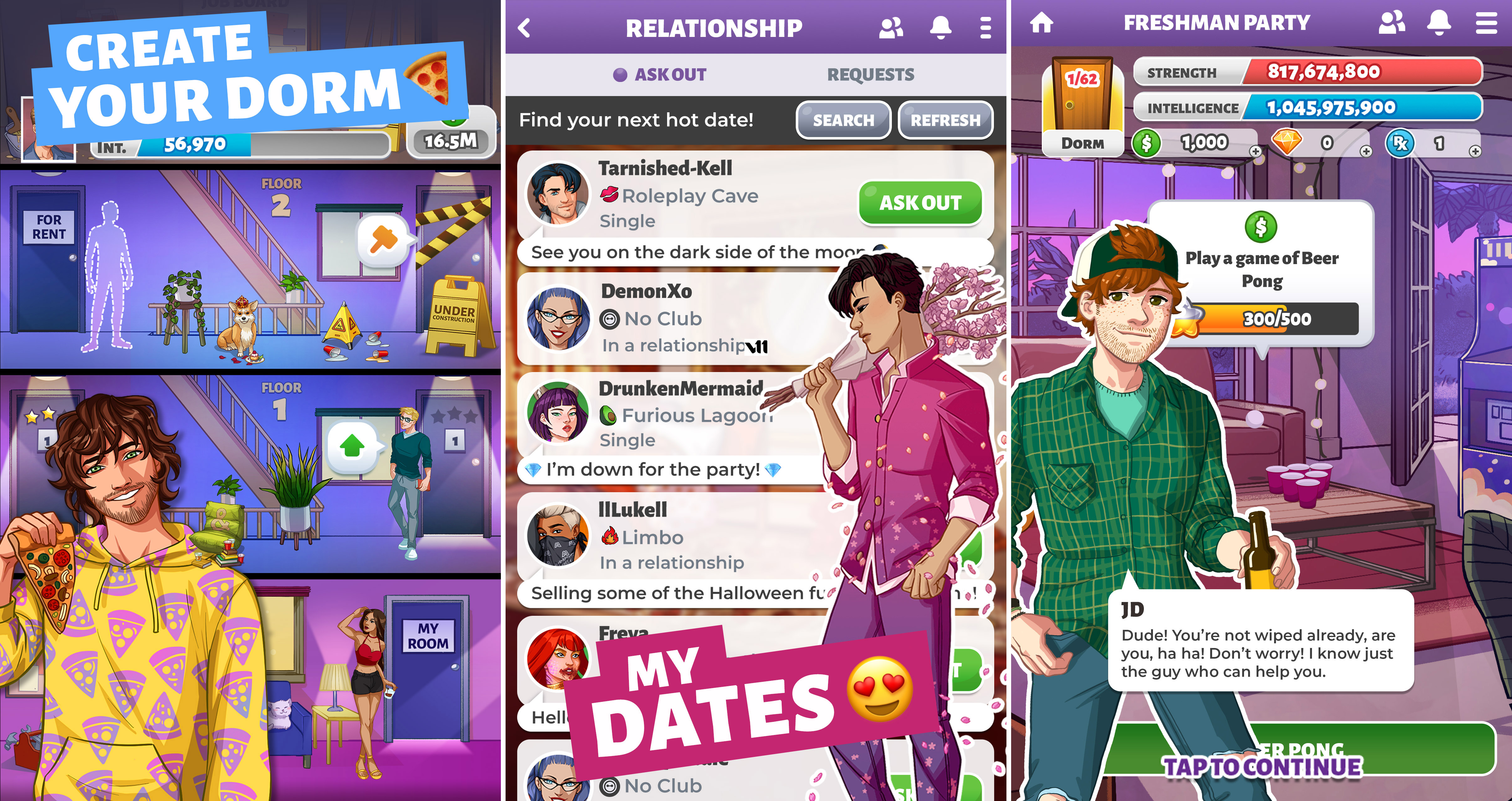 ASO screenshots researches
 ASO screenshots researches

